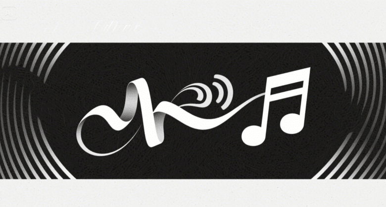
Each font has rhythm — some march along in big strides, others dance in cursive movement. When typography springs into action, it does not merely convey words; it acts. Typographers now work with letters as dancers on the page of a design, leading the viewer through tempo, flow, and feeling. Whether a kinetic poster or a stripped-down commercial, type is now choreography — a visual rhythm you can almost hear.
This dance now has a new companion: AI creativity. Through tools like Dreamina, marketers and artists can explore motion-inspired typography and type-based imagery. An AI photo generator allows creators to see how fonts would move, like living things — curving, jumping, or breathing along the page. What’s left is typography that does not remain static; it moves people.
When typography is movement
Typography’s potential comes from its form — but movement provides it with spirit. Designers these days try out graphic pacing that echoes dance rhythms. A headline put in a strategic location can be like an unexpected turn; a lowercase placed delicately can emulate a slow, deliberate pace. The choreography is derived from where the eye travels: from heavy to light, from condensed to extended, from static to dynamic.
A few of the most engaging configurations toy with:
- Directional motion: moving the eye along curves and diagonals that mimic movement.
- Rhythmic spacing: balancing silence (negative space) and stress for tempo.
- Repetition and contrast: varying fonts and weights to create beat-like visual repetition.
- Gestural typefaces: employing fonts that inherently evoke motion — brush strokes, curves, and loops.
Each one of these effects produces visual music. The type as a performer, and the layout as choreography — an interplay of tempo and texture.
Where letters find their rhythm with Dreamina
Typography has ever been the art of balance — between weight and room, between what is said and what is seen. But when you approach text as choreography, design starts to throb with its own rhythm. Every serif is a delay; every curve, a pirouette. Dreamina makes this a participatory process, where designers can actually “compose” using light, motion, and type.
Step 1: Write a detailed text prompt
Start by going to Dreamina’s “AI Image”. Picture you’re staging a performance — not only what you want to watch, but how it must move.
For instance, try writing: A moving poster with strong sans-serif lettering that flows in sweeping curves over a pale background, letters posed as if performing in mid-air beneath studio lights, gentle shadows giving depth and rhythm.
This considerate prompt illustrates Dreamina how to convert motion into design, where the words appear to breathe — not print.
Step 2: Set parameters and generate
Once your prompt is finished, set your creative parameters to your idea’s energy. Select the correct model for typed proximity, select an appropriate aspect ratio for your layout (posters are portraits, a digital post is square), and set a size for readability. To achieve quality, toggle between 1K and 2k to test the crispness of your visual typography’s flow. Finally, click Dreamina’s icon to generate your image — when your text starts to dance.
Step 3: Edit and download
After generating your image, take it a step further with Dreamina’s AI customization tools. Employ inpaint to fine-tune letter curves, grow to provide additional breathing room to text, remove to clear away unwanted items, or retouch to refine the overall rhythm of the composition. When your type arrangement feels harmoniously choreographed, tap the Download icon to save and introduce your creation into the world — a poster, an advertisement, or a visual poem in motion.
How AI enhances typographic choreography
What really makes modern typography so impressive comes from the back and forth between human creativity and how machines process it all. Designers used to keep those wild ideas locked in their sketchbooks. AI steps in now to help bring them to life. Think about a serif font that seems to leap straight off the page. Or script letters carrying this textured breath of their own.
Dreamina’s AI logo generator, for example, is where these experiments come alive. You can see how brand identities take shape through the rhythm of typography — designing logos where minimalism and motion intersect. A startup brand mark could curve like a ribbon; a music brand lettering could ripple like soundwaves. Typography is identity in motion, reflecting the very spirit of what it symbolizes.
Color, tone, and typographic emotion
Each movement in type has emotional undertones — just as each dancer expresses feeling through movement. Designers can employ color to enhance typographic rhythm:
- Soft gradients to express calm and continuity.
- High-contrast color schemes to create drama and tempo.
- Monochromatic tones to heighten form and flow over distraction.
When you pair movement with mood, your layout is a whole performance — one that communicates not only in words, but in feeling.
The silent art of pacing
In dance, rests are as important as steps. In typography, too. Negative space — the breath between letters, the pause between lines — produces the visual breath that establishes rhythm. Good designers work with spacing like a good conductor works with silence, giving the viewer’s eye a chance to rest, recharge, and move on.
This is what pacing does in design:
- It makes messages feel deliberate, not urgent.
- It focuses on hierarchy — the lead act vs. the ancillary dancers.
- It makes reading a flow, not a friction, experience.
Dreamina’s flexibility enables you to imagine pacing in motion — tweaking the way type plays with space and shape, testing until your message glides just so.
Sharpening your design with AI sophistication
Once the foundational structure stands firm, even the tiniest modifications can transform a design from something lifeless into a vibrant harmony. Tools powered by artificial intelligence prove especially useful in this phase. Designers employing Dreamina’s AI image editor can refine their typographic elements with precision.
They might apply motion blur to infuse a feeling of dynamic energy. Adjustments to shadow gradients could introduce subtle rhythms. Enhancing textures allows letters to gain a more tangible presence. This process resembles the final preparations before a live performance. Each detail receives careful shaping until the overall composition flows with seamless grace.
The concluding flourish
Typography remains a discipline rooted in exactitude throughout its history. In the current era, however, it extends into the realm of movement as well. Examples range from kinetic posters to advertisements animated for social platforms. The most compelling designs avoid mere static arrangements. Instead, they unfold as dynamic displays of light, shape, and storytelling. Dreamina makes that notion into reality, allowing artists to choreograph their images with creativity and accuracy.
In this new age, fonts no longer occupy space — they move. And with Dreamina, all designers are turned into choreographers of motion, balance, and rhythm — transforming letters into living, breathing art.